Forex charts can feel overwhelming at first.
Lines move constantly.
Candles form patterns.
Prices react in seconds.
For many beginners, charts look like chaos. But to experienced traders, charts tell a story — one built from price behavior, market psychology, and collective decision-making.
Technical analysis is not about predicting the future with certainty. It is about reading what the market is doing now, understanding context, and making structured decisions based on observable information.
This article explains the fundamentals of reading forex charts using technical analysis, in a practical and realistic way.
What Is Technical Analysis in Forex?
Technical analysis is the study of price movement using charts.
It focuses on:
- Price behavior
- Historical patterns
- Market structure
- Trader psychology
Rather than asking why price moves, technical analysis asks how price moves.
In forex, where information flows quickly, charts often reflect market sentiment faster than fundamentals.
Why Forex Traders Use Charts
Charts provide a visual record of market activity.
They help traders:
- Identify trends
- Spot potential support and resistance
- Recognize momentum
- Understand volatility
Charts do not make decisions for traders — they support better judgment.
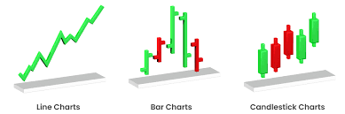
Types of Forex Charts
There are several common chart types used in forex trading.
Line Charts
Line charts connect closing prices over time.
They are simple and useful for:
- Identifying overall direction
- Reducing visual noise
However, they lack detailed information.
Bar Charts
Bar charts show:
- Open
- High
- Low
- Close
They provide more detail than line charts but can be harder to read quickly.
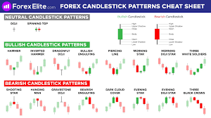
Candlestick Charts
Candlestick charts are the most widely used.
Each candle shows:
- Opening price
- Closing price
- High
- Low
Candlesticks visually represent buying and selling pressure, making them popular for technical analysis.
Understanding Time Frames
Time frames define how much data each candle represents.
Common time frames include:
- Short-term (minutes)
- Medium-term (hours)
- Long-term (daily or higher)
Higher time frames show clearer structure. Lower time frames show more detail — and more noise.
Experienced traders often analyze higher time frames first, then refine entries on lower ones.
Reading Market Trends
Trends are one of the most important concepts in technical analysis.
An uptrend shows:
- Higher highs
- Higher lows
A downtrend shows:
- Lower highs
- Lower lows
A sideways market moves within a range.
Trading with the trend generally reduces complexity and emotional pressure.
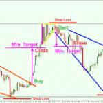
Support and Resistance Levels
Support and resistance represent areas where price has reacted before.
Support is where price tends to stop falling.
Resistance is where price tends to stop rising.
These levels are not exact points — they are zones.
Understanding them helps traders:
- Define risk
- Plan entries and exits
- Avoid chasing price
Chart Patterns and What They Represent
Chart patterns reflect crowd behavior.
Some common examples include:
- Consolidation ranges
- Breakouts
- Pullbacks
Patterns do not guarantee outcomes. They offer context, not certainty.
Indicators: Tools, Not Answers
Technical indicators are mathematical calculations based on price or volume.
Common indicators include:
- Moving averages
- Momentum indicators
- Volatility measures
Indicators help confirm observations, but they should not replace price analysis.
Too many indicators often create confusion rather than clarity.
Volume and Market Activity
In forex, centralized volume is limited, but activity indicators still matter.
They help traders:
- Gauge participation
- Confirm breakouts
- Identify exhaustion
Volume supports analysis — it does not lead it.
Reading Charts Without Overthinking
One of the biggest mistakes traders make is overanalysis.
Effective chart reading focuses on:
- Structure
- Direction
- Key levels
Simplicity improves consistency.
If a chart feels confusing, it often means conditions are unclear — and that may be a signal to wait.
The Role of Risk Management in Chart Reading
Charts do not remove risk.
They help define it.
Technical analysis supports:
- Stop placement
- Position sizing decisions
- Trade invalidation points
Knowing where a trade is wrong is more important than knowing where it might go right.
The CEO Mindset: Charts as Decision Tools
Professionals view charts the way executives view reports.
Charts:
- Provide information
- Support planning
- Reduce emotional reactions
They are tools for structured decision-making, not emotional reassurance.
What Technical Analysis Cannot Do
Technical analysis does not:
- Predict news
- Eliminate losses
- Guarantee outcomes
It improves probability, not certainty.
Understanding this keeps expectations realistic.
Building Skill Through Practice
Reading forex charts is a skill developed over time.
It improves through:
- Repetition
- Observation
- Journaling
- Reviewing mistakes
Confidence grows from experience, not shortcuts.
Final Thoughts: Charts Tell a Story — Learn to Listen
Forex charts are not random.
They reflect fear, confidence, hesitation, and momentum — all expressed through price.
Technical analysis helps traders read this story objectively, without emotion or hype.
You don’t need to predict every move.
You need to understand context, manage risk, and respond thoughtfully.
When charts become information instead of intimidation, trading becomes clearer — and far more controlled.
End of article.
Summary:
Descriptions of various charts and technical indicators.
Keywords:
forex, forex trading, learn forex, forex online
Article Body:
Price charts can be simple line graphs, bar graphs or even candlestick graphs. These are graphs that show prices during specified time frames. These time frames can be anywhere from minutes to years or any time interval in between.
Line charts are the easiest to read, they will show you the broad overview of price movement. They only show the closing price for the specified interval, they make it very easy to pick out patterns and trends but do not provide the fine detail of a bar or candlestick chart.
With a bar chart the length of a line displays the price spread during that time interval. The larger the bar is the greater the price difference between the high and low price during the interval. It is easy to tell at a glance if the price rose or fell because the left tab shows the opening price and the right tab the closing price. Then the bar will give you the price variation. When printed bar charts can be difficult to read but most software charts have a zoom function so you can easily read even closely spaced bars.
Originally developed in Japan for analyzing candlestick contracts candlestick charts are very useful for analyzing FOREX prices. Candlestick charts are very similar to bar charts they both show the high, the low, open and close price for the indicated time. However the color coding makes it much easier to read a candlestick chart, normally a green candlestick indicates a rising price and a red one indicates a falling price.
The actual candlestick shape in reference to the candlesticks around it will tell you a lot about the price movement and will greatly aid your analysis. Depending on the price spread various patterns will be formed by the candlesticks. Many of the shapes have some rather exotic names, but once you learn the patterns they are easy to pick out and analyze.
Price charts are not usually used by themselves to get the full affect you need to supplement them with some technical indicators. Technical indicators are normally grouped into some pretty broad categories. Some of the more common ones used to monitor and track the market movement are: trend indicators, strength indicators, volatility indicators, and cycle indicators.
Here is a list of some of the more commonly used indicators as well as a brief description.
Average Directional Movement Index (ADX) � This index will help indicate if the market is moving in a trend in either direction and how strong the trend is. If a trend has readings in excess of 25 then this is considered a stronger trend.
Moving Average Convergence/Divergence (MACD) � This shows the relationship between the moving averages which allows you to determine the momentum of the market. Any time that the signal line is crossed by the MACD it is considered to be a strong market.
Stochastic Oscillator � This compares the closing price to the price range over a specific time frame to determine the strength or weakness of the market. If a currency has a stochastic of greater than 80 it is considered overbought. However if the stochastic is under 20 then the currency is considered undersold.
Relative Strength Indicator (RSI) � This is a scale from 1 to 100 to compare the high and low prices over time. If the RSI rises above 70 it is considered overbought where as anything below 30 is considered oversold.
Moving Average � This is created by comparing the average price for a time period to the average price of other time periods.
Tinggalkan Balasan